I interviewed 4 people ages 35-70.


When thinking of Mirror as a brand I wanted it to invoke the feelings of safety and excitement. Bright, yet natural colors with soft, linen and denim-like textures bring on a sense of peace and everyday comfort.

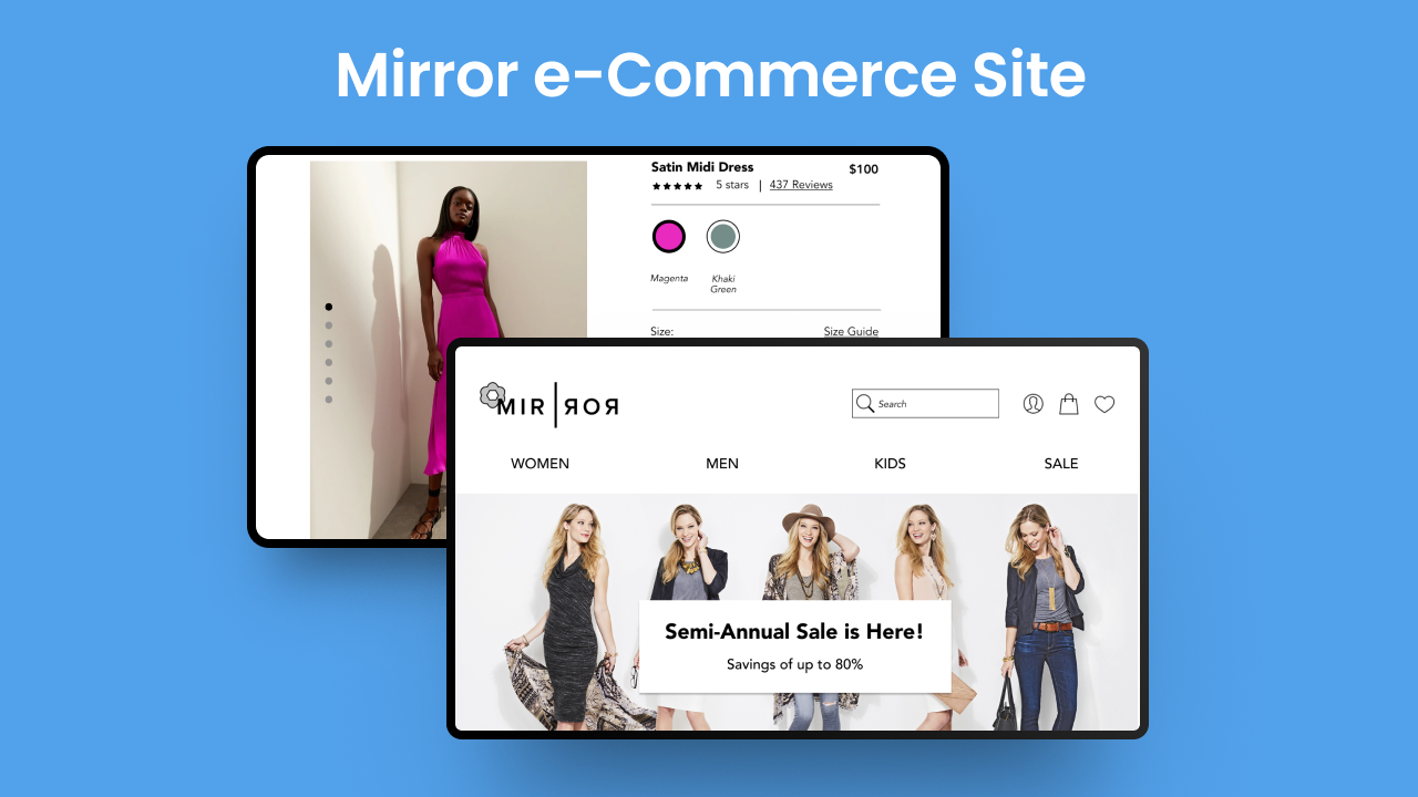
What does Mirror look like? The idea was to design something simple, relatable, and memorable. Symmetry plays a crucial role here, with a reflection line (representing an actual mirror) breaking up the two halves of the brand name. A feminine touch was added with a flower in the upper-left hand corner.

Based on usability test findings I made the decision to prioritize the following product page revisions:
There was a lot to tackle in this project and every single part of it was a learning experience. Research & testing focused on a myriad of user issues & spanned across various processes & areas of concern. To me they represented some of the more interesting parts of the process that really put me in touch with the user and provided a host of valuable and insightful information that directly influenced the end product.
Wireframing, prototyping and all the UI “in-betweens” were exciting in their own right because they really allowed me to express my ideas and learnings from user interactions and translate them over to actual designs.
If you like what you see and want to work together, get in touch!
irina.adler@gmail.com